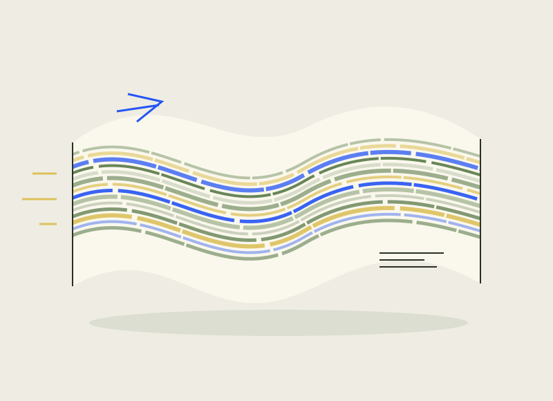
Vinya Llarga is Catalan for long vineyard. Atipus gives the name a graphic extension: a band of yellow, green and blue wraps around the bottle, recalling a landscape seen from a moving train. Creative Boom featured the Maria Rigol Ordi project on 29 October.
The idea has an advantage over a long explanation on the back. The eye registers movement before working through the details. The colour band operates on a curved surface; you want to turn the bottle to follow it. The physical form of the packaging takes part in reading the image.
We like the economy of the gesture. One clear device lets the rest of the graphics stay quiet, without collecting five more metaphors about soil and tradition. It’s a useful quality for a presentation, too: the idea fits into one sentence. All that remains is to avoid spending the next forty slides proving that it really does.