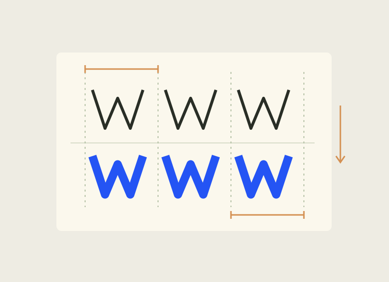
Twista Sans appeared in Creative Boom’s October selection on 27 October. Its designer Viktor Nübel describes it as uniwidth: each character retains its width across weights. That doesn’t mean monospaced; different letters can still have different widths.
The practical point is familiar to anyone whose button has jumped on hover. When text becomes bolder, you want to change emphasis rather than rearrange its neighbours. Stable widths let you separate those jobs; the designer’s site includes demonstrations.
For a project, still check your own strings, sizes and required languages. A useful property doesn’t replace suitable letterforms. Weight animation needn’t run constantly, either: sometimes the best way to show an interface is alive is to let it stand still. Especially when someone is only trying to press Save.